Posts

Showing posts from February, 2022

Planning Blog: Additional Information- Ironing Out The Edges

Image
  Hello, I'm glad to see that you've returned for our official planning blog, regarding the way in which we will keep things running smoothly, no matter what challenges we may face. Below you'll find that I've divided our plan up into five different sections so that everything is easier to understand and visualize.  Participants:     In order to ensure that the participants and each of their roles for this particular project are clear, I've broken down each of their "positions" below: *Actors- Anthony as "Ronnie" Tanya as "Mom" Filming- Jordyn Minnis Nicole Kimmick Julissa Espinal Yaneli Zelaya Editing- Jordyn Minnis Directing- Jordyn Minnis * Regarding our official actors, our finalizations will be made within the coming week; however, we are currently putting in one of our groupmates' friends as he was interested in the role. When it comes to the role of Mom, one of our teammate's parents has also agreed to play that role. Add...
Planning Blog: Title Design- It's in the Details

Image
  Well hello there! We are now going to explain the layout and formatting of the title design for our opening sequence. As of right now, all of the design ideas we have outlined below will likely be those that we will be using going forwards; however, there is still the possibility that we may decide to make changes as our production process continues and we reach the editing stage of our project. After scouring the internet, we found and settled on using the "Sometimes" font, being that it was not as gaudy as some of the others that we encountered online and, as such, would not detract attention away from the film itself, but it would still be able to properly credit each participant. Additionally, said font's use of sharp edges allows it to create a tense feeling that feeds into the thriller aspect of our film.      When it comes to ensuring that each of our titles are readable, we will likely not embed all of them into our scenes and run the risk of them...

Script Blog: Writing the outline

  Welcome back! In today's blog, we've outlined the script for our film opening below to ensure that we have a clear idea of sound cues, the places where we would like to insert editing, the dialogue, and the shots used within our film so that we are able to film more efficiently and not have to worry about coming up with ideas on the spot. With that being said, I hope that our script gives you a detailed and entertaining insight into our upcoming opening. Enjoy!  Script: 1  EXT. HOUSE - DAY An establishing wide shot is used to show that the RONNIE's house has dead and sickly-looking grass in its yard, and the weather outside seems to be overcast and gloomy. A dissolve is used to cut to the next scene. 2  INT. KITCHEN - DAY A long, full-body shot is used to show as RONNIE walks over to and sits down at the dining table. CANNED FRUITS are scattered about the room. A cut then occurs to a medium close-up shot of the dining table upon which a BOWL OF MISCELLANEOUS ITEMS ...

The Design Research: Science Fiction Thriller- "Code 8": What Makes This Film Great

Image
  Hello again! In this blog, we will be reviewing the title sequence for the 2019 film, "Code 8," which we obtained from the "Art of the Title" website. We will be responding to six questions to help us analyze this movie's opening below: What titles are displayed during the opening sequences? As the title sequence plays, they credit the companies and people who were involved in the creation of the film. This includes the main studio company and its associates, as well as other film companies that were involved in the production process. It displays the names of the executive producers and non-executive producers, along with the names of the designers for costumes, music, story, photography, and visual effects, and, of course, the editors. The names of the main cast members are also presented on screen and, at the end, the director's name and the film's title are shown. These titles were not embedded and were written in white, changing to adopt a new s...

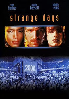
Title Design Research: Science Fiction Thriller- "Strange Days": Virtually Endless Possibilities

Image
    Hi and thank you for joining us as we analyze our fourth, and final, film opening from the 1995 film, “Strange Days,” which we can across on the “Art of the Title” website.      Just like we've done in the past three blogs, I will be answering a series of questions that will provide us with a comprehensive analysis of the film's opening title sequence.  What titles are displayed during the opening sequences?     As the movie begins, the title sequence is quite simple and much shorter than the other openings we’ve seen thus far. It begins by introducing the film studio, production company, and the movie’s title, all of which are shown against a blank, black background, fading in and out of the screen and changing from green, to blue, and finally to red whilst doing so. Being that the titles appeared on an empty, black screen, we can say that they were not embedded.  What images are prioritized in the opening sequence?     As the ...